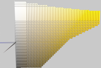
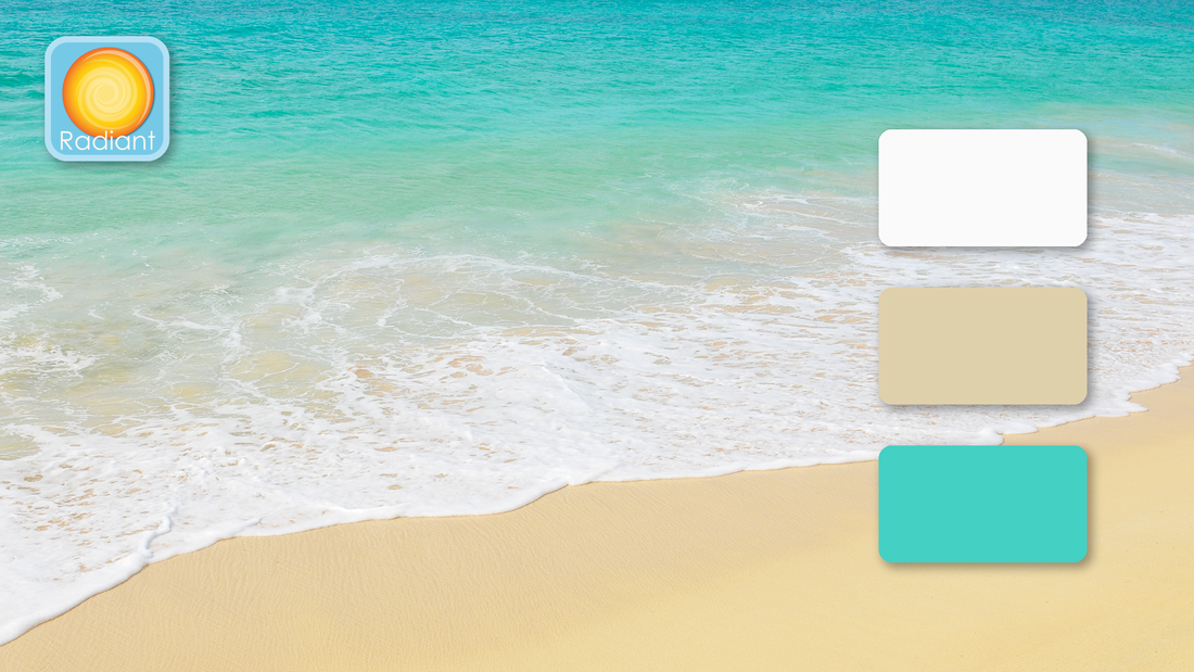
 The sun is shining, coaxing nature to continue to roll out her blanket of color, leading those of us becoming more and more restless from staying cooped up indoors – whether alone or with far too much family time – to give in to either impatience or complacency and to question the need to continue taking such intense measures to avoid this invisible enemy, even though we know it is causing so much pain and death. Given all this, tropical beaches with clear teal green water, warm golden sand, white frothy waves and palm trees swaying in the breeze may well be on many dreamily yearning minds these days. However, most beaches are closed and traveling to the tropics is definitely off the table. And yet, might the need – literal and figurative – for such healing waters be so great that some are defying common sense and common good by storming beaches and capitols? I bring up this image because even I, an avowed hermit who was delighted to have to stay home, and feeling gratefully blessed that I am able to comfortably work from home, but who has not been to a tropical beach in decades, have found myself imagining what it would feel like to immerse myself in such clear waters, surrounded by those intense colors. There is, of course, no substitute for the baptismal-like full immersion experience of being there, but I have been thinking about what needs these colors represent and how consciously bringing them into our lives might aid us through this particular phase of this crisis. Let’s start with the color of water in this image. Blue-green, teal green, turquoise green and aqua (from the Latin word for ‘water’) are some of the terms used for versions of this color. Although there are some pine trees dressed in subtle blue-greens, and some gloriously exuberant bird plumage – think peacocks! – this hue appears in nature mostly in the form of water. Apart from tropical beaches and lagoons, it is often the color of mountain lakes, some rivers and melted glacial waters. Psychologically, this color is cleansing and purifying as it brings on feelings of calmness and rejuvenation. It is regenerating. Which, of course, is a helpful color during times of both mental and physical stress. Emotionally, it embodies compassion by uniting the healing and soothing qualities of green with the protective and steadfast aspects of blue. Blue-green compassion differs from magenta compassion in that it focuses on cleansing and healing, whereas magenta speaks to the loving-kindness and nurturing attributes of compassion. It is more fluid while magenta is more enclosing, cuddly. The golden sand tones belong to the tan/olive family in RCS. This is a most unusual and probably undervalued hue. What could be more boring that the color of sand, right? Or tree bark. Or fatigues. Careful – do not be deceived, for it conceals secret gems! As you can see from the illustration, in 3-D color space, tans and olives are located underneath bright, sunny yellow. And you will also notice that bronze, brass and precious gold are part of this slice of color space. Tans were used to create the gold effect in the RCS logo, for example. So, this unassuming hue literally has hidden depths, and can be of great value – should you be willing to access it. This unexpected aspect of tans unobtrusively invites you to look for the gold within, much as walking on sands gives your calves a good workout if you want to get to that refreshing blue-green water. You’ll have to be determined in order to access your true metal. But then, where the water meets the sand, there is that light, white foam that unites and balances regeneration with grasping your inner worth by offering you a clean slate from which to take the next step. In Greek mythology, Aphrodite was said to return every year to her place of birth and bathe in the sea. This renewed her virginity. But virginity, in those days, did not mean what it does today: it meant that she renewed her one-in-herself-ness, her sovereignty of self, her wholeness. As author Esther Harding explained the concept, ‘virginity is a process of being true to oneself, and, most significantly if we have not been true (as many of us have not for many reasons), our virginity is renewable.” So, male or female, this palette invites you to come back to your center, should you have been pulled away from it by anxiety, fear, boredom, stress, pain and bring you back to this uncertain here-and-now fully equipped to deal with it. In the hope of inspiring you, I’ll create some samples of this palette in various Color Zones and post them in the next few days.
1 Comment
Joan hibbs
7/28/2020 07:42:56 am
You are so rIght about this combination of colors. My reaction to this photo of the water and beach was excitement a d joy. A clean sense ... fresh and light. Spiritually uplifting. Thank you.
Reply
Leave a Reply. |
Color StoriesColor Zones = Color Psych 101 - The foundation, the mood and energy setting. Archives
September 2020
Categories |
© 2019 - 2022 Resonance Color. All rights reserved.


 RSS Feed