
let's talk about color
Let’s talk about how we talk about color. Let’s talk about what is a color and what is not.
Let's talk about it in a way that works for us in the 21st century.
Let's talk about it in a way that works for us in the 21st century.
colors, non-colors & neutrals
Did you know that in the 12th century, the color spectrum was bookended by black and white? It was: white, yellow, red, green, blue, purple and black.
But when Newton came along in the 17th century and proposed the color wheel based on the rainbow we still use today, he knocked white and black off the spectrum. So they were no longer considered colors.
Surely, this is a disservice to both black and white? Even now, the color world is ambivalent about whether black and white are actual colors - they've been bundled into a non-color-ish category we call neutrals, along with grays, beiges, tans and others.
The Resonance Color System is all inclusive: it welcomes every color nuance in all hues – no matter how chromatically challenged they may be. So it is comprised of 15 color families/hues: gray, white, black, yellow, tan/olive, orange, beige/brown, red, magenta, purple, indigo blue, blue, blue-green, green, and yellow-green.
warm vs. cool
are all blues cool and all yellows warm?
Traditionally, one side of the color wheel is ‘cool’ (blues, purples, greens) while the other is ‘warm’ (yellows, oranges, reds). This worked well for Newton (1642-1726) and Goethe (1749-1832), but we need more subtlety today. With the millions and millions of possibilities at our fingertips, for colors to truly resonate with each other, we need to get more granular. We need to take into account temperature within each hue, their sub-temperatures, that is, warm yellows and cool yellows; warm blues and cool blues.
The Resonance Color System goes a step further and brings in the concept of balanced colors into our vocabulary in order to include color nuances that are neither warm nor cool.
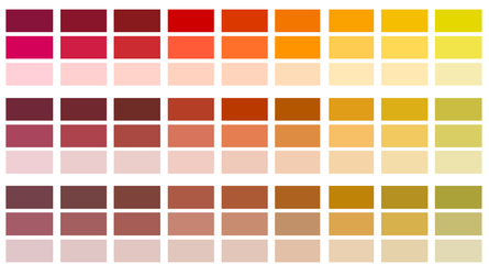
This concept helps shift our perspective from thinking of a warm color as one having a yellow undertone and a cool one as having a blue undertone, to considering where it is located in the visible spectrum continuum – for example, notice in the illustration below as you read it from left to right that various forms of cool red (all lines on column 1) are followed by balanced reds (all lines on column 2), and warm reds (all lines on column 3) and then moves to cool oranges, balanced oranges and warm oranges. These are followed by warm yellows, balanced yellows and cool yellows.
The Resonance Color System goes a step further and brings in the concept of balanced colors into our vocabulary in order to include color nuances that are neither warm nor cool.
This concept helps shift our perspective from thinking of a warm color as one having a yellow undertone and a cool one as having a blue undertone, to considering where it is located in the visible spectrum continuum – for example, notice in the illustration below as you read it from left to right that various forms of cool red (all lines on column 1) are followed by balanced reds (all lines on column 2), and warm reds (all lines on column 3) and then moves to cool oranges, balanced oranges and warm oranges. These are followed by warm yellows, balanced yellows and cool yellows.
color resolution: saturation + value
is bright too bright?
..."savage nations, uneducated people, and children have a great predilection for vivid colours"
Johann Wolfgang von Goethe, 1810
Clear, bright, pure color. Somewhere in between color. Soft, subtle, grayed, muted color. What's the difference?
Though fashion still favors 'preloved', 'faded', 'grayed' – low saturation colors – for those stylishly in the know, colors of higher saturation and values are nonetheless much in demand by people of all ages, level of civility and education in a variety of applications.
The Resonance Color System (RCS) defines and incorporates three levels of color resolution, a concept that encompasses saturation (how much chroma is in a color, how pale or strong it is) and value (the lightness through brightness to darkness scale). These three levels are: muted (grayed, faded, subtle colors), intermediate (colors not quite muted and not quite clear) and clear/pure colors (includes tints, bright and dark colors, but no grayed colors).
Resonance Color Zones
why do some colors go well together and others don't?
We all know the rules of color harmony. Complementary colors. Split complementaries. Analogous colors. Triads. But with so many color nuances to choose from, it is often overwhelming – and time consuming – to create a pleasing color combination. Why is this?
Mystery gone. Colors that go well together – resonate with each other – share common, quantifiable qualities. The Resonance Color System (RCS) not only identifies the necessary qualities, it also gathers together all colors sharing those resonating qualities into Color Zones. Pick any one of the 9 Color Zones and start harmonizing. Super easy!
Mystery gone. Colors that go well together – resonate with each other – share common, quantifiable qualities. The Resonance Color System (RCS) not only identifies the necessary qualities, it also gathers together all colors sharing those resonating qualities into Color Zones. Pick any one of the 9 Color Zones and start harmonizing. Super easy!