
stunning colors, together
There is no such thing as an ugly color. Well, maybe there is – colors you and I don't like are ugly.
And yet, even the most unlikeable color, when surrounded by other colors with which it resonates, is beautiful. It does not matter that these are not colors we would choose for ourselves. When colors resonate with each other, the combination brings out the best in each color, and together they are exquisite.
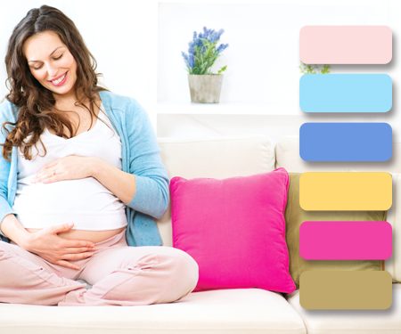
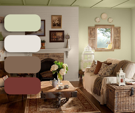
Choosing colors for a palette from a single Color Zone allows a very specific message and tone to be created, which will come across clearly and cohesively, both psychologically and aesthetically.
All the colors in a Color Resonance Zone, by definition, resonate with each other, and do so at a uniquely distinct level – a level common only to the colors in that particular Color Zone. Even though each color on its own has an individual message or effect on us, all the colors within a Color Zone combine to give that Color Zone a very specific character. The nuances innate to each individual color all come together as individual strands in the character of that Color Zone – much as personality and character traits do in people.
And yet, even the most unlikeable color, when surrounded by other colors with which it resonates, is beautiful. It does not matter that these are not colors we would choose for ourselves. When colors resonate with each other, the combination brings out the best in each color, and together they are exquisite.
Choosing colors for a palette from a single Color Zone allows a very specific message and tone to be created, which will come across clearly and cohesively, both psychologically and aesthetically.
All the colors in a Color Resonance Zone, by definition, resonate with each other, and do so at a uniquely distinct level – a level common only to the colors in that particular Color Zone. Even though each color on its own has an individual message or effect on us, all the colors within a Color Zone combine to give that Color Zone a very specific character. The nuances innate to each individual color all come together as individual strands in the character of that Color Zone – much as personality and character traits do in people.
1. Ethereal
cool muted colors
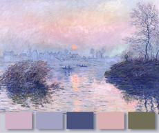
energycomposed, introspective, subtle
|

expressionelegant, refined, discerning
|
valuesdignity, grace, discretion
|
2. Luminous
cool intermediate colors
energysavvy, skillful, astute
|

expressionpolished, focused
|
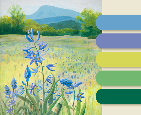
valuesexcellence, thoughtfulness, thoroughness
|
3. Brilliant
cool, clear/pure colors
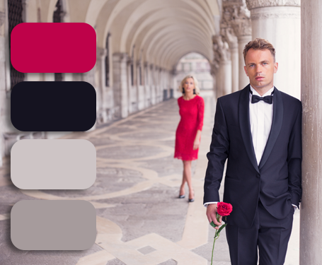
energycharismatic, artful, progressive
|

expressiondramatic, sophisticated, authoritative
|

valuesconfidence, precision, wisdom
|
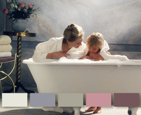
4. Misty
balanced muted colors
energyresourceful, efficient, accommodating
|

expressionsensitive, heartfelt, conscientious
|
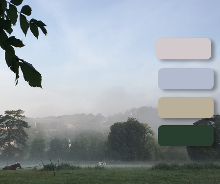
valuespatience, sincerity, industry
|
5. Vital
balanced intermediate colors

energyflexible, adaptable, vigorous
|

expressioncentered, receptive, expansive
|
valuesmindful, genuine, resilient
|
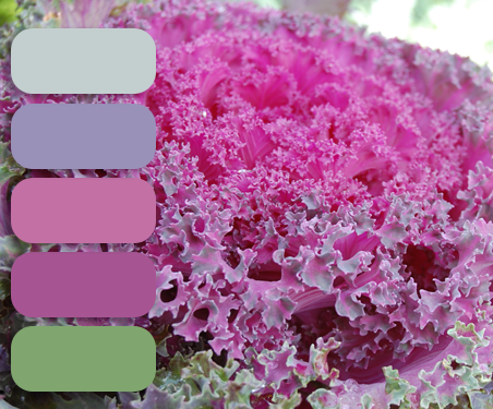
6. Radiant
balanced clear/pure colors
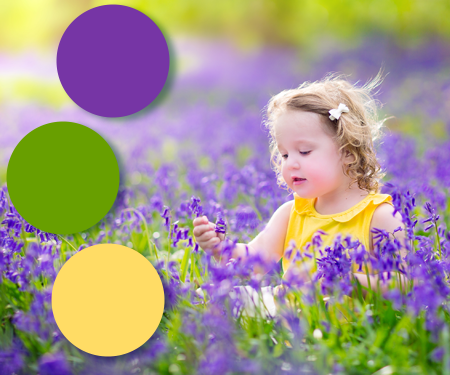
energyspontaneous, enthusiastic, audacious
|
expressionjoyous, energetic, vivacious
|
valuesperceptiveness, frankness, innocence
|
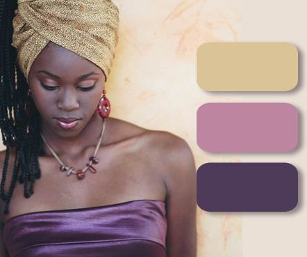
7. Earthy
warm muted colors
energypractical, dependable, grounded
|

expressioncomfortable, sensuous
|
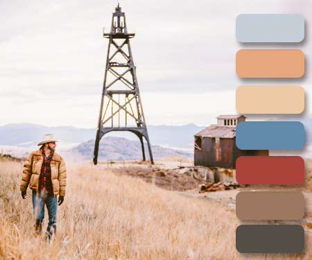
valueshonesty, faithfulness, generosity
|
8. Natural
warm intermediate colors
energystraightforward, enterprising, active
|

expressionrefreshing, nourishing, inviting
|
valuesfriendliness, loyalty, determination
|
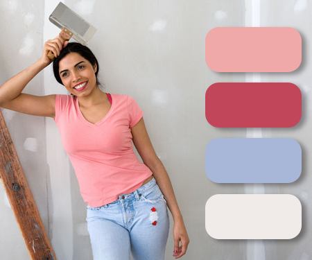
9. Vibrant
warm clear/pure colors

energyexuberant, engaging, charming
|

expressionfresh, optimistic, passionate
|
valuescreativity, flexibility, idealism
|