|
So... how can you bring the regenerating, cleansing effect of this blue-green, tan and white color palette into your life right now, while continuing to shelter at home?
Well, here are some ideas. If the weather is hot, I’d start with a water balloon fun-filled battle. If it is still too cool for that, go through your closet for some clothes in these colors. Whether you like popping bright RADIANT colors or softly flowing ETHEREAL colors, the refreshing effect will be the same for you. If you can, make your bedroom into an oasis of rejuvenation by keeping it light, with just a touch of teal green. MISTY colors lend themselves beautifully – and most elegantly – to this concept. The bathroom is the perfect room to create a faux-beach effect, and warm, sunny VIBRANT colors will do the job nicely. Tiling the bathroom in watery teal-greens might be a restful, meditative job – assuming you have the peace and quiet in which to do it. Or just add an object or two here and there in these colors. Every little bit helps!
0 Comments
Pink? Weren't these supposed to be magenta color combinations, you ask? Yes, quite right. To clarify, these rosy pinks are part of the magenta color family in the Resonance Color System (RCS). Think of them as light magentas. To illustrate this magenta, white and yellow-green palette, I've picked colors from the Miller Paint Company's Color Is collection based on their shared qualities of warmth and clarity - qualities which place them into one of nine distinct Color Zones, as illustrated below. 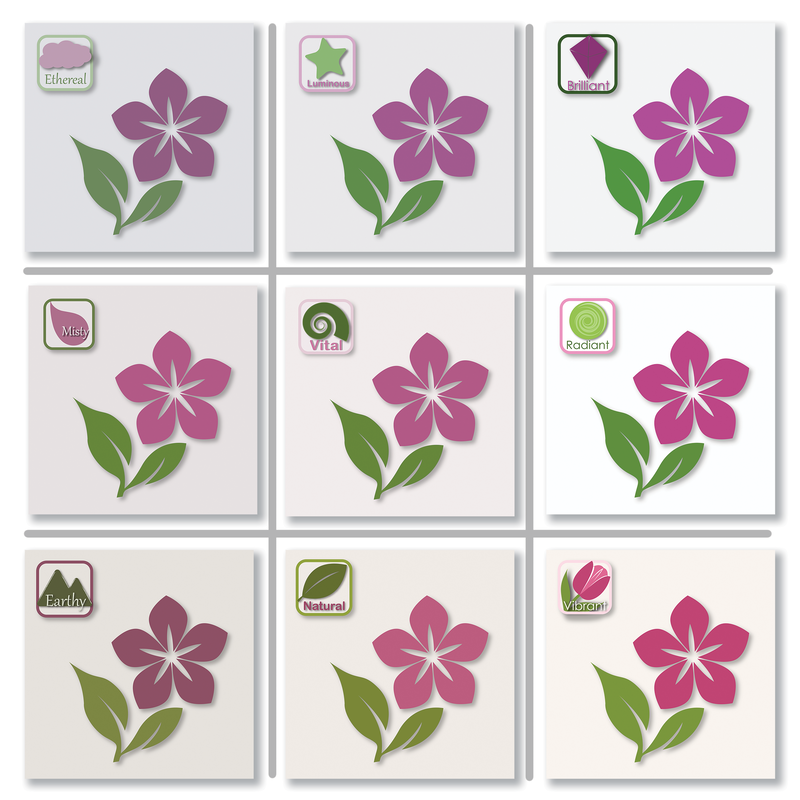 The differences are subtle, but that's what RCS is all about. As you can see, each one of the colors in the illustrations on the bottom row are warmer - the white is creamy, for example. On the top row, the colors are cooler - the magenta is more purply, the white bluer. This shows the difference in temperature between Color Zones. Also, if you focus on the columns of the illustration, you will notice that the images in the left column are more faded, as if they were in the shade, particularly compared to the ones on the right column. They are, indeed, muted or grayed versions of the colors on the right column. In RCS, muted vs clear are the qualities that address color resolution. Colors sharing the same temperature and resolution do look fabulous together. They also create a certain feeling or mood as a Color Zone. (More details about each Color Zone here). And that makes all the difference when you are choosing colors for that just-right-for-you space. Or outfit. Or graphic design. Color Zones set the foundation for a color combination - they are color psych 101 - which is then fine-tuned for your needs by the individual color families you choose from within that Color Zone. As an example, look at how different the same setting is in the illustration below. The EARTHY combination is softer and more comfy, whereas the VIBRANT combination feels more lighthearted and fun. And yet, they are both warm. Which do you like better? 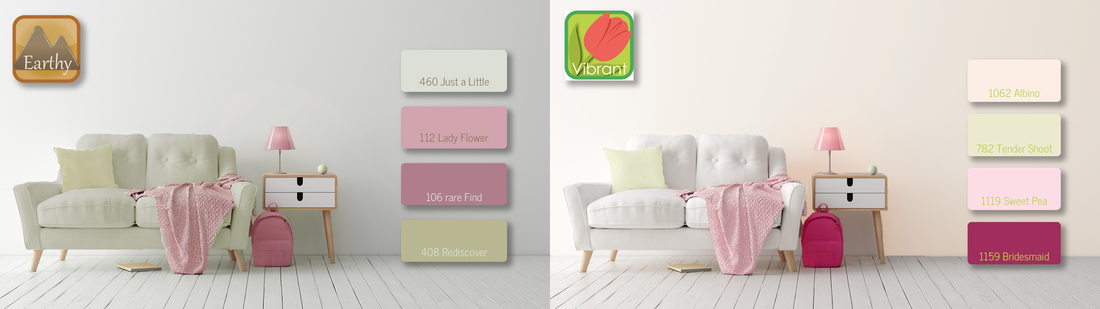 The best Color Zone for you and the Healing Palette that you choose may well depend on your project, on what you need colors for - painting a room for your child? For you? The family room? An art project? Your wardrobe?
Most likely, there will be a Color Zone that feels like it is so YOU. Let me know when it emerges... I'd love to hear from you. |
Color StoriesColor Zones = Color Psych 101 - The foundation, the mood and energy setting. Archives
September 2020
Categories |

 RSS Feed
© 2019 - 2022 Resonance Color. All rights reserved.