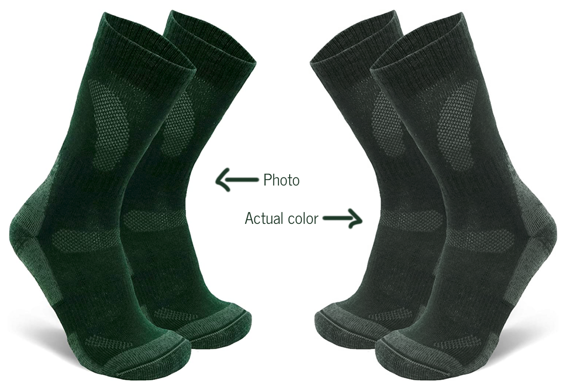
 The photo showed a beautiful deep, rich, abundantly alive pine green. But when the socks arrived, it looked like one of the super-fit guys in the company’s videos had gone hiking in them for two weeks and then sent along his dirty socks. Not that the socks were actually dirty, mind you. It was just that the color was disappointingly dingy.
It is not surprising, really, as fashion trends in the past decade have strongly favored muted, washed out, subtle versions of colors. It is a reflection of the times in which we are living. The trend started with the 2008 recession with grays and grayed colors becoming all the rage for home interiors as well as clothing. So why green socks? Well, here I was on the first day of fall 2020: we had reached the very sad milestone of 200,000 deaths in the US due to the coronavirus, with an ideologically divided country in the midst of a contentious election, the south of the country flooded and the western coast on fire. Just a week before, with fires a mere 12 miles from my home, I was among the thousands on alert for evacuation. (Today, finally, the fires are contained enough that all evacuation orders in our county have been rescinded.) So, when the rains came and brought back clean, breathable air, I found myself craving the simple pleasure of a warm pair of socks, and a rich, healing green felt like just the thing. But the dingy color of the socks that arrived at my door was too reminiscent of the dirty, smoky air that had surrounded us to meet the need of the moment, even if the socks might have been very warm. Disappointed, I returned them. Talk about color power, right? Being in the right Color Zone really matters!
0 Comments
So... how can you bring the regenerating, cleansing effect of this blue-green, tan and white color palette into your life right now, while continuing to shelter at home?
Well, here are some ideas. If the weather is hot, I’d start with a water balloon fun-filled battle. If it is still too cool for that, go through your closet for some clothes in these colors. Whether you like popping bright RADIANT colors or softly flowing ETHEREAL colors, the refreshing effect will be the same for you. If you can, make your bedroom into an oasis of rejuvenation by keeping it light, with just a touch of teal green. MISTY colors lend themselves beautifully – and most elegantly – to this concept. The bathroom is the perfect room to create a faux-beach effect, and warm, sunny VIBRANT colors will do the job nicely. Tiling the bathroom in watery teal-greens might be a restful, meditative job – assuming you have the peace and quiet in which to do it. Or just add an object or two here and there in these colors. Every little bit helps! 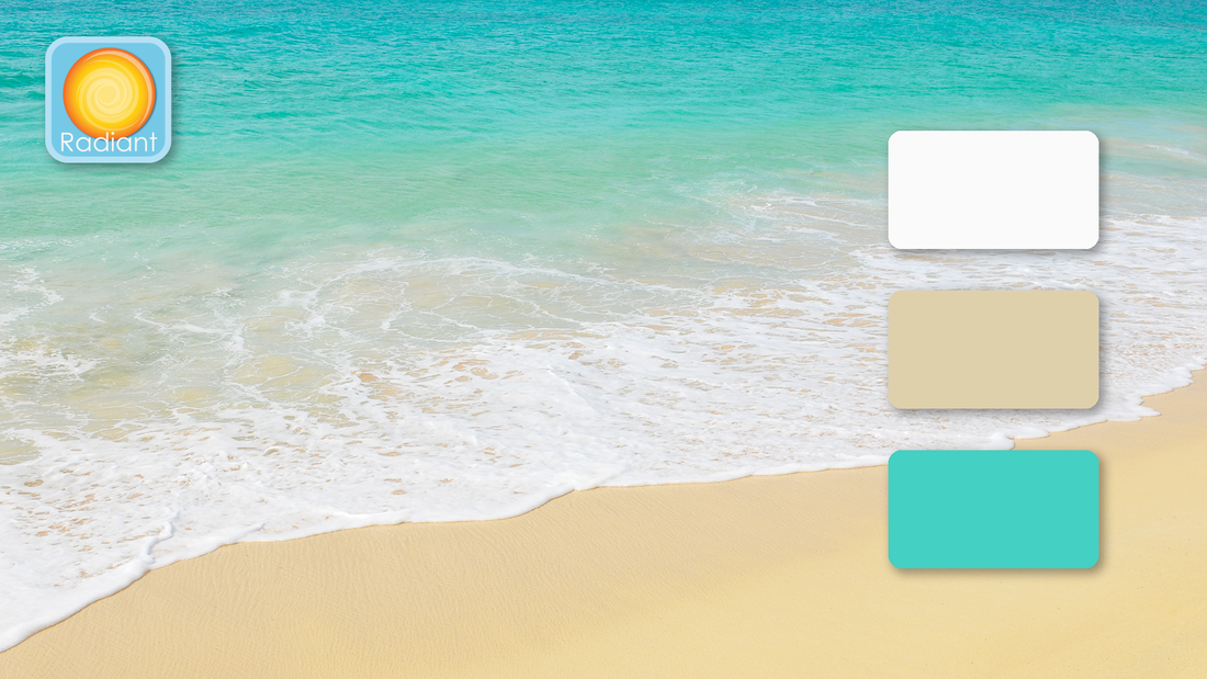 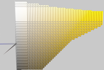 The sun is shining, coaxing nature to continue to roll out her blanket of color, leading those of us becoming more and more restless from staying cooped up indoors – whether alone or with far too much family time – to give in to either impatience or complacency and to question the need to continue taking such intense measures to avoid this invisible enemy, even though we know it is causing so much pain and death.
Given all this, tropical beaches with clear teal green water, warm golden sand, white frothy waves and palm trees swaying in the breeze may well be on many dreamily yearning minds these days. However, most beaches are closed and traveling to the tropics is definitely off the table. And yet, might the need – literal and figurative – for such healing waters be so great that some are defying common sense and common good by storming beaches and capitols? I bring up this image because even I, an avowed hermit who was delighted to have to stay home, and feeling gratefully blessed that I am able to comfortably work from home, but who has not been to a tropical beach in decades, have found myself imagining what it would feel like to immerse myself in such clear waters, surrounded by those intense colors. There is, of course, no substitute for the baptismal-like full immersion experience of being there, but I have been thinking about what needs these colors represent and how consciously bringing them into our lives might aid us through this particular phase of this crisis. Let’s start with the color of water in this image. Blue-green, teal green, turquoise green and aqua (from the Latin word for ‘water’) are some of the terms used for versions of this color. Although there are some pine trees dressed in subtle blue-greens, and some gloriously exuberant bird plumage – think peacocks! – this hue appears in nature mostly in the form of water. Apart from tropical beaches and lagoons, it is often the color of mountain lakes, some rivers and melted glacial waters. Psychologically, this color is cleansing and purifying as it brings on feelings of calmness and rejuvenation. It is regenerating. Which, of course, is a helpful color during times of both mental and physical stress. Emotionally, it embodies compassion by uniting the healing and soothing qualities of green with the protective and steadfast aspects of blue. Blue-green compassion differs from magenta compassion in that it focuses on cleansing and healing, whereas magenta speaks to the loving-kindness and nurturing attributes of compassion. It is more fluid while magenta is more enclosing, cuddly. The golden sand tones belong to the tan/olive family in RCS. This is a most unusual and probably undervalued hue. What could be more boring that the color of sand, right? Or tree bark. Or fatigues. Careful – do not be deceived, for it conceals secret gems! As you can see from the illustration, in 3-D color space, tans and olives are located underneath bright, sunny yellow. And you will also notice that bronze, brass and precious gold are part of this slice of color space. Tans were used to create the gold effect in the RCS logo, for example. So, this unassuming hue literally has hidden depths, and can be of great value – should you be willing to access it. This unexpected aspect of tans unobtrusively invites you to look for the gold within, much as walking on sands gives your calves a good workout if you want to get to that refreshing blue-green water. You’ll have to be determined in order to access your true metal. But then, where the water meets the sand, there is that light, white foam that unites and balances regeneration with grasping your inner worth by offering you a clean slate from which to take the next step. In Greek mythology, Aphrodite was said to return every year to her place of birth and bathe in the sea. This renewed her virginity. But virginity, in those days, did not mean what it does today: it meant that she renewed her one-in-herself-ness, her sovereignty of self, her wholeness. As author Esther Harding explained the concept, ‘virginity is a process of being true to oneself, and, most significantly if we have not been true (as many of us have not for many reasons), our virginity is renewable.” So, male or female, this palette invites you to come back to your center, should you have been pulled away from it by anxiety, fear, boredom, stress, pain and bring you back to this uncertain here-and-now fully equipped to deal with it. In the hope of inspiring you, I’ll create some samples of this palette in various Color Zones and post them in the next few days. Pink? Weren't these supposed to be magenta color combinations, you ask? Yes, quite right. To clarify, these rosy pinks are part of the magenta color family in the Resonance Color System (RCS). Think of them as light magentas. To illustrate this magenta, white and yellow-green palette, I've picked colors from the Miller Paint Company's Color Is collection based on their shared qualities of warmth and clarity - qualities which place them into one of nine distinct Color Zones, as illustrated below. 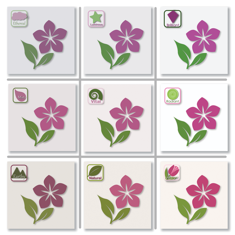 The differences are subtle, but that's what RCS is all about. As you can see, each one of the colors in the illustrations on the bottom row are warmer - the white is creamy, for example. On the top row, the colors are cooler - the magenta is more purply, the white bluer. This shows the difference in temperature between Color Zones. Also, if you focus on the columns of the illustration, you will notice that the images in the left column are more faded, as if they were in the shade, particularly compared to the ones on the right column. They are, indeed, muted or grayed versions of the colors on the right column. In RCS, muted vs clear are the qualities that address color resolution. Colors sharing the same temperature and resolution do look fabulous together. They also create a certain feeling or mood as a Color Zone. (More details about each Color Zone here). And that makes all the difference when you are choosing colors for that just-right-for-you space. Or outfit. Or graphic design. Color Zones set the foundation for a color combination - they are color psych 101 - which is then fine-tuned for your needs by the individual color families you choose from within that Color Zone. As an example, look at how different the same setting is in the illustration below. The EARTHY combination is softer and more comfy, whereas the VIBRANT combination feels more lighthearted and fun. And yet, they are both warm. Which do you like better? 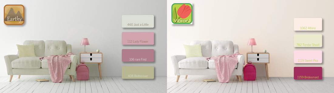 The best Color Zone for you and the Healing Palette that you choose may well depend on your project, on what you need colors for - painting a room for your child? For you? The family room? An art project? Your wardrobe?
Most likely, there will be a Color Zone that feels like it is so YOU. Let me know when it emerges... I'd love to hear from you. 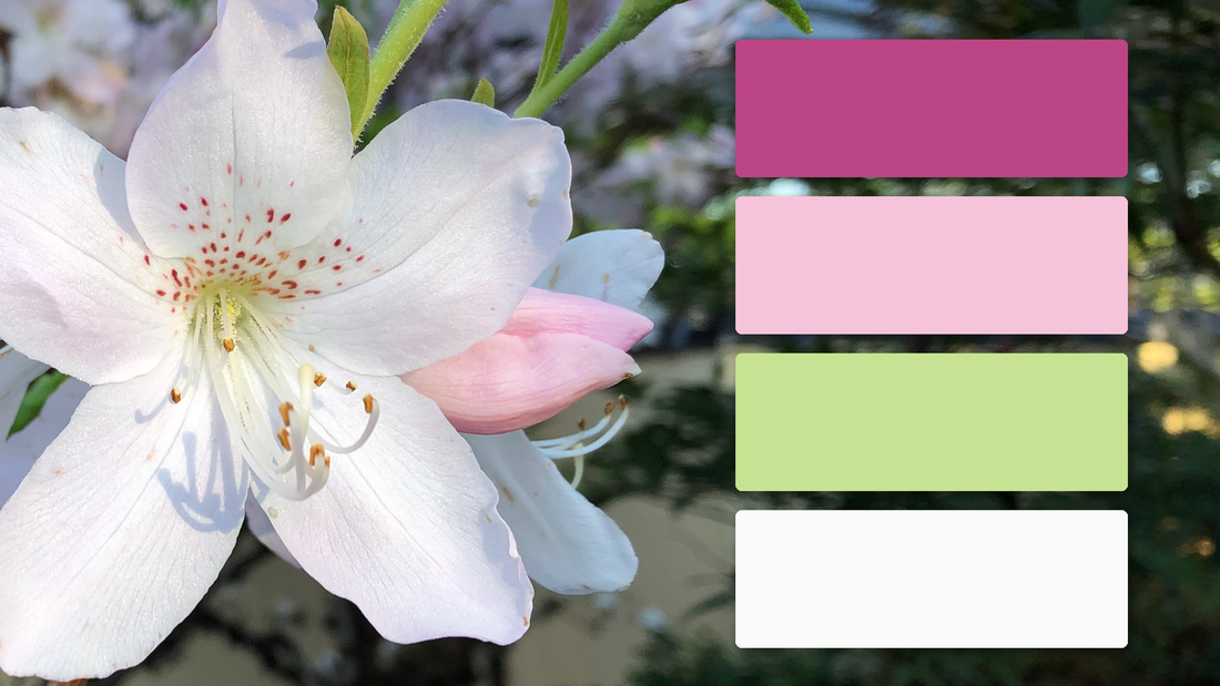 Magenta is everywhere I look in my garden this early spring, presenting itself in forms varying from the softest pinks to exuberantly dramatic hot pinks. This may seem an unlikely choice for the first color in a healing palette, but the essence of magenta has actually been the first thing to burst forth as the coronavirus epidemic hit us: in the crisis response, the values of loving-kindness, responsive compassion, humanity and imaginative resourcefulness embodied by magenta have been the shield used by our frontline responders, despite being bombarded by chaos from all sides.
Lighter magentas – rosy pinks – are nurturing, in the way that a parent cuddles and protects a baby. A feeling of safety that most of us yearn for right now in such anxiety-laden times, right? New growth green, the predominant green of this time of the year, is included in this palette for its qualities of suppleness, flexibility, tolerance and openness. It is also a color that encourages curiosity, discovery, exploration – much needed as we adapt to our new circumstances and find new ways to connect with each other. White wipes the slate clean. It is the color of hope. With its bright, clean purity, it opens us to all possibilities while brushing away debris. This palette therefore brings together compassionate resourcefulness and nurturing with the flexibility and tolerance needed to deal with our current world while keeping hope alive. Lots of examples of this palette in the next post!  It is a gloriously sunny Spring afternoon here in northern Oregon. It’s the perfect temperature for a walk to stretch legs and disperse mental cobwebs. The frogs in the pond have started their evening serenade early. Cherry blossom snow has blown away, tulips open their faces to the sun in the morning, close them in the evening, and the rhododendrons are bursting out in stages here and there – trying to keep up with the azaleas. Idyllic.
And yet, today, in this country, we have lost another 2000+ people to this virus that is ravaging the world. It is heartbreaking. And it adds to the anxiety, fear, worry and stress we are all feeling to one extent or another as we social distance while looking out for one another and mourn loss of lives, jobs and independence of movement. And yet, many of us are also finding this to be a time of introspection and mindful self-searching. So, as someone passionate about colors – how they affect us, support us, resonate with us – I began to wonder how we might use color to help abate the negatives and boost the positives of our current situation. Healing palettes, perhaps? In each posting, I’ll talk about the psychological and emotional effects of a single hue/color family and then create color combinations with it. The end goal is to build out a full palette for each Color Zone with samples from all 15 Resonance Color hues using different media – paint colors, yarns and graphics. All hues will be included because what may feel healing to me is not necessarily what is healing for you. Although we are all in this together, we are affected differently and therefore will follow different paths of recovery. With the paint colors, I’ll propose palettes for your consideration should sheltering in place include painting your walls in order to create a personally supportive ‘color trend’ that works for you and your family during this challenging time. As for the yarn, I bought a packet of 109 gorgeous mini skeins of Scheepjes Catona some time ago. I’ve sorted them into their respective Color Zones and will crochet them into an assortment of flowers motifs. I’m imagining flowering cushions, handbags, tablemats, and… well, we’ll see what emerges. Now, for the graphics, given that I am not a graphic designer, I will rely on the designs of talented graphic designers who have made their work available through various subscription services. OK. I’ll get started. Please check back every few days for a new addition to healing palettes. |
Color StoriesColor Zones = Color Psych 101 - The foundation, the mood and energy setting. Archives
September 2020
Categories |

 RSS Feed
© 2019 - 2022 Resonance Color. All rights reserved.